
When you reach the point in your business when you need to design your pitch deck, things will hopefully be moving along nicely. You might have launched your MVP, acquired your first customers, or reached a new stage of development in your deep tech solution. Pitch decks are going to be part of your life as an entrepreneur and founder for the foreseeable future. Every round of funding you’re going to want to dust off the old decks, update them and send them back round. You’ll have different decks for different situations, and you’ll know them like the back of your hand.
In this guide, we are going to cover:
- The essential design principles for your deck
- How to style your deck appropriately
- What makes good pitch deck content
Style and Design Your Pitch Deck
Design is key. Not only do well-designed pitch decks hold people’s attention for longer, but they also create an automatic air of authority. They entice, they allure, and they bring the audience into the story that you are trying to craft. Importantly, the bar for a well-designed pitch deck isn’t particularly high – you don’t need a team of designers to labour for months through hundreds of revisions. Rather, a simple, clean, aesthetically consistent design will be as effective as a pure creative deck with custom hand-drawn illustrations… depending on your business and target market.

What will suffer and impede your attempts to communicate your value proposition is a deck that has multiple fonts, inconsistent style, sizing, and has no narrative flow. But if you follow the simple rules outlined below, you can drastically mitigate or remove these errors from the beginning, saving you time and money.
Design Your Pitch Deck Consistent, but With Minimal Branding
The people that will review the decks that you create will review hundreds, if not thousands, of decks a year. You are not trying to stand out from the crowd with your branding, trying to do so with an over-the-top attempt typically backfires. If an investor wants to move forward with a deal, your content, message and pitch should entice them to do that.
Where branding stands out and comes into its own is when investors see multiple materials either at different times (turning you down at seed but interested at Series A) or if they request other documents from you which all follow your brand style.
A consistent brand has, at a minimum, the following attributes:
- A primary and secondary colour – these can be used as accent colours, as text colours, or simply integrated into the icons and graphics to maintain a focused identity. Use websites like color.adobe.com to help you find complementary colours.
- A static logo – what we mean by this is that you shouldn’t be changing your logo all the time. Take the time to get it right and then leave it. It needs to be consistent across all your documentation, decks and communications (think email footers). You can use free services like Hatchful to generate ideas to refine, or use paid services like 99designs or Fiverr to create a logo.
- Thematic Images – what is your startup doing? What is its mission? Your images need to be on-brand to that mission. If you’re helping cancer patients’ families with a new support technology, then your brand theme will be different from a company championing a new product in graphite production. Services like Unsplash provide free images for you to use – start looking here.
- Icons styled consistently – If you’re going for clean minimal icons, keep them all that way, if you’re going for the hand-drawn, friendly feel stick to that. Whichever you pick, make sure they stay consistent. An easy way to do this is just getting them from the same source, such as Icons8.
Set Font Tone to Design Your Pitch Deck
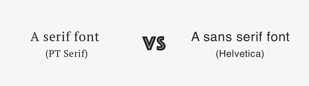
Choosing the right font is important; it is similar to brand in the sense of dictating how your audience might perceive your deck. The cleanest is san serif fonts (the ones without feet and hats at the edges of letters). However, these are not always the easiest to read from far away or in smaller font sizes. If legibility is a concern (i.e. you’re presenting, and you don’t know how large the room is, or how far people will be sitting from your screen) using sans serif fonts but with slightly increased letter spacing will allow for the greatest legibility. If your deck is going to be printed and read on good old-fashioned paper, then serif will work well as this is where it is more legible than sans serif.
If you have to include a lot of text (although something that you should be trying to avoid), then you will also want to use a sans serif fonts as they make bigger blocks of text easier to read. If you’re stuck trying to pick a font – opt for Helvetica or Open Sans for san serif and PT Serif for a serif font.
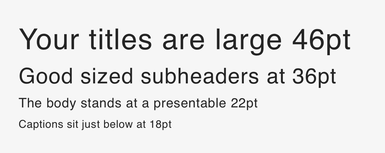
On the subject of font size – it needs to be large. Larger than you think; especially if you are presenting the deck. Your titles, at a minimum, should be 36pt, and then subheaders, body, and captions should follow in consistently decreasing sizes. By doing this, you establish an informational hierarchy that is easy to understand and perceive.
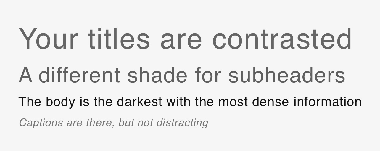
Other ways to improve your informational hierarchy are to use varying shades of a primary colour with the headers and body. If, for example, your headers are a dark grey, then you might want to make your body text a darker grey or even black to further distinguish and improve comprehension. Another way you can distinguish captions from body text is by making them italic, for example.
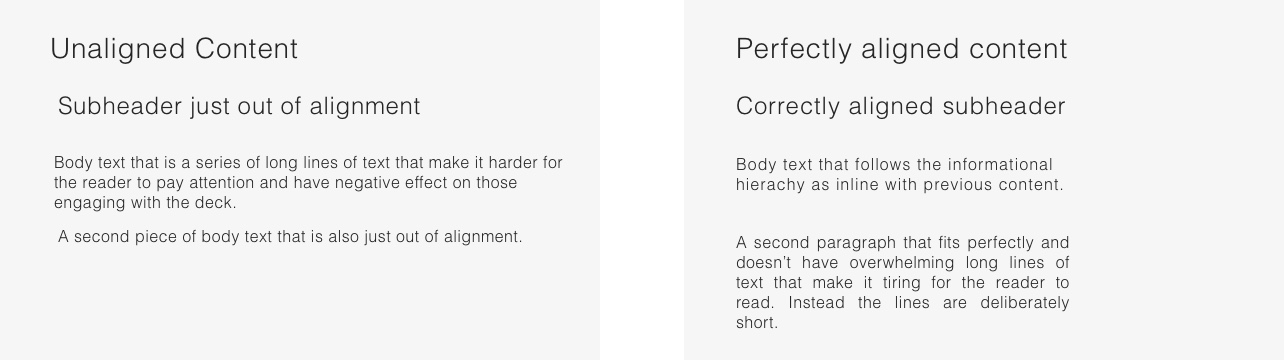
The last thing to be aware of with fonts and text is consistent alignment; if you are making the slides yourself, you need to keep the spacing and text edges aligned. If titles, subheaders and body all start from the same point on the slide, then they need to be aligned, if they’re slightly out even by a few pixels something will feel off about the slide. Further, this also includes the length of lines of text, the longer they are, the longer they will take to read. If you have to use a lot of text, shorten the line length to give the reader an easy break between lines.
Clear Slide Labels
These need to be big, as we’ve already touched on, but also clear and simple. Instead of “AirToasts’ Amazing, World Leading Team” just have “Team”. Let the credentials and the slide speak for itself. Don’t try to cram everything into the slide title. If the deck is going to be read, then a simple informational hierarchy will go a long way to making things clearer for your readers.
When presenting a deck, this will be slightly different, your labels might be used less frequently, and you’ll use headers and subheaders to iterate the key point that you’re talking about at that moment.
In both circumstances, the information needs to be clear and to the point.

Diversify Slide Layouts
A simple way to increase engagement and retain attention, something that is required if the average pitch deck has an investor only looking at it for 3 minutes and 44 seconds (Docsend, 2017) – changing the layout of slides. Mix up that Powerpoint or Keynote base slide layout by having creating unique content arrangements. By having exclusive layouts for different slides, you help visually distinguish ideas and concepts throughout the deck.
Not to say that all slides have to be completely original in their layout or form but use graphics and icons along with arrows and imaginative arrangements to inject some creativity into the deck. This will help keep people interested throughout and reduce the chance that they would just skip through pages.

Crafting Good Pitch Deck Content
Much like design, there is an art to good pitch deck content, do not be surprised if the final text is different from the first draft; this is completely normal. Succinctly explaining ideas and concepts is an incredibly difficult thing. Being able to do that while also trying to convince someone to invest in your business in the same words makes it even more challenging.
We’ve outlined several key concepts that can help achieve this goal when writing your pitch deck below.
One Idea Per Slide
Kevin Hale, a partner at Y Combinator, co-founder of Wufoo and UX expert, is a firm believer that “simple ideas are ones that aren’t intertwined with other ideas. They are one-fold. They are one idea. A simple slide, therefore, expresses one idea. Do not crowd your slides with multiple ideas.” Having multiple ideas across one slide leads to confusion and problems communicating. At its core, a single idea is the easiest to express, and the easiest to understand. Avoiding confusion is key to imparting your vision for the company and expressing your achievements.
Create a Story
You are part of your own story. It’s your drive to build your company, your mission. What are you doing, and why are you doing it? What makes you get up every morning and strive to develop this company?
If you can answer these questions, then you have a story to tell, and this should be reflected in your deck, especially at the early stages. When you reach later series of funding, your story will be similar, but it will have sequels, you’ll be able to tell people how far you’ve come and how others have helped you get where you are. Then you focus on taking it to the next level and how your story will continue.
A startup story is always more compelling with evidence and data; if you have conducted market research, independent studies, or asked 100 customers to fill out a survey, you have more information to help you paint the landscape of your company and what you are trying to achieve. If the problem you’re tackling is so common that nearly everyone experiences it, strike a chord with investors and put them in your shoes to show them how you will solve this particular problem, and why everything has aligned for you to be that person.
A simple story can be told in 3 parts:
- What is the problem?
- How are you going to solve it?
- Why are you the right people to solve it?
Add your personal touch, make it real to the potential investor, bring the problem home for them so they can really connect with your mission, then sell them on your unique solution/approach and how your team is skilled and committed to solving it.
Engage Emotions (Make it Personal)
Following on from telling a compelling story, you will want to engage your audience’s emotion during the pitch. If this is in person, this will be significantly easier (as they can see and hear you), than if you’ve simply attached a pdf to an email.
People make gut decisions based on emotions and feelings, ration and reason come second. Perhaps confusingly, gut decisions aren’t made in the gut but actually by your reptilian brain, this is part of our brain that is leftover from our early evolution and is over 500 million years old. In How the Brain Works, Leslie A. Hart talks about how much “evidence now indicates that the limbic area (reptilian brain) is the main switch in determining what sensory inputs will go the Neocortex and what decisions will be accepted from it”.
What does this mean? It means that you need to send the right message to your audience, early and quickly to avoid having the rest of what you say simply be rejected by their ancient mental gatekeeper. Logic and emotion cannot be used at the same time by people. Therefore, you need to structure your pitch to engage the emotional aspects, pique the interest of the reptilian brain with inspiration; engagement, emotionally evoking stories or images, and then make a rational appeal only once you have done this.
Anett Grant, CEO of Executive Speaking Inc, explains that pitching requires a level of sales, that when you start, “you sell the features. When you get better, you sell the benefits. And when you get really good, you sell the dream.” The key to a good pitch is making the audience feel something, and the best way to do that is to paint the dreams you have for your company’s future, and how they can be a part of it.
Show Don’t Tell
Having coached over two and a half thousand international tech startups on pitching to investors, clients, and potential partners, and who’s students have raised an average of €4 million; Beth Susanne has much experience crafting pixel-perfect decks. She has two rules that she tells all her students.
One. Bullet points are good, headlines are better, and images are best.
And Two. If they’re reading the slide, they’re not listening to you.
Whilst using images, rather than simply writing text, is one good way to show rather than tell; you can also edit the evidence you do show. For example, if you simply tell investors that your product is good, that is nowhere near as effective as having honest customer reviews declaring their love for the product.
Skip the Details
You know everything about your business, every detail, every in, every out, and at some point, a potential investor might want to know that too. But it shouldn’t be in your pitch deck; there are other documents that are better suited to passing that information on. The pitch is there to start the initial attraction, to get in the door and move the relationship forward. At later stages, you can begin to bare the company details.
Limit the information in your deck to the headlines and summaries, ignore the superfluous and erroneous details. We’ve collated some examples of the top pitch decks we’ve seen from businesses that have successfully raised funds with Seedrs, have a look at our Pitch Deck Library for inspiration.
Thinking about raising funds with Seedrs?
Raise funds with us and join some of the most exciting and cutting-edge startups who put our services to the test every day. Submit your application today or contact us directly to discuss your fundraising ideas in more depth.


